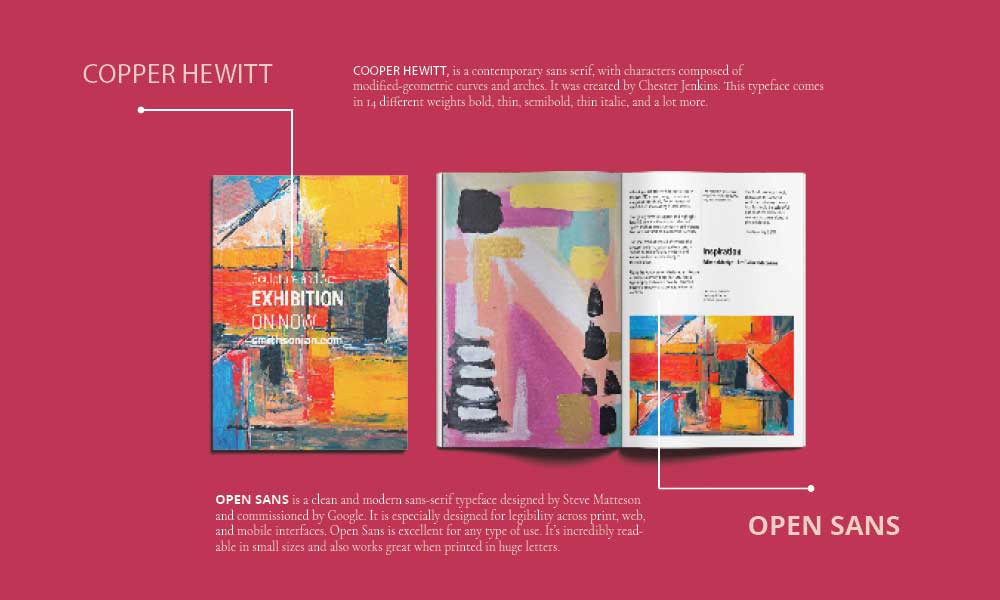
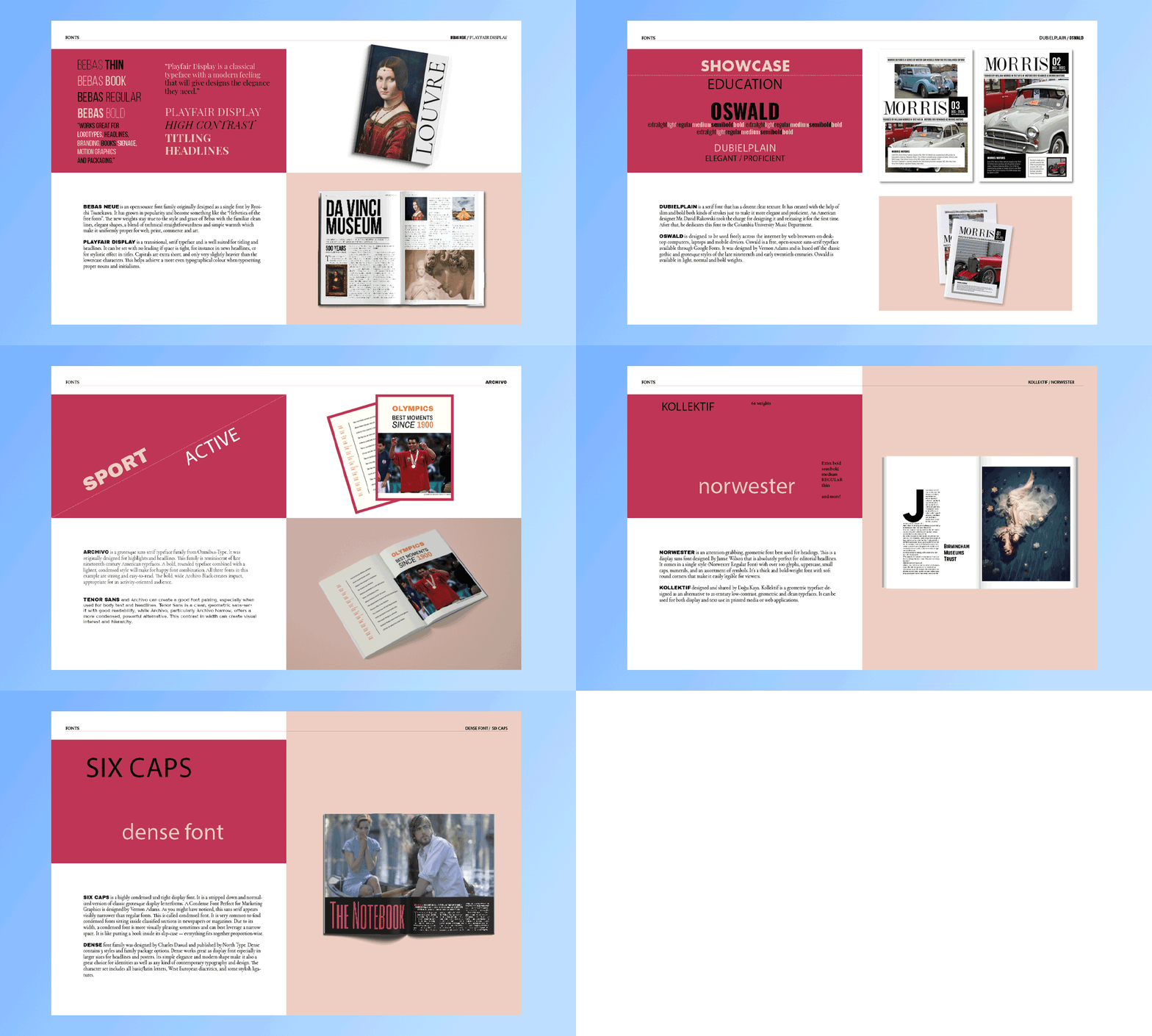
Typography is more than just choosing pretty fonts—it's about infusing your design with emotion and clarity. Pairing fonts effectively can drastically elevate your design, ensuring it's not only visually appealing but also easy to read. Let's explore how to master font pairing, focusing on balance, contrast, readability, and simplicity. Whether you're designing a document, magazine, book, or advertising material, mastering font pairing is essential.
Let’s explore how you can elevate your design by focusing on balance, contrast, readability, and simplicity. Your primary focus should be on how easily the text can be read. Avoid overly decorative fonts for large blocks of text. Keep it simple. Use no more than two fonts in a single design to avoid clutter. Typically, pairing a serif with a sans-serif font creates a visually pleasing balance. Ensure there's enough contrast between the fonts to distinguish different sections of your content.
This could be through size, weight, or style. While traditional font pairing strategies work well for most designs, some projects may benefit from breaking the rules. Experimental designs, for instance, might intentionally use clashing fonts to create a bold statement. However, this approach requires a deep understanding of typography and a clear vision to ensure the design remains coherent and purposeful. Try out different pairings to see what works best for your project. Look at other designs or resources online for font-pairing inspiration.
Online tools and platforms offer font pairing suggestions and previews, helping you visualize the outcome. Viewing your design on different devices or printing a test copy can help you evaluate the readability and overall appeal. Typography is not just about aesthetics; it's about crafting an experience.


