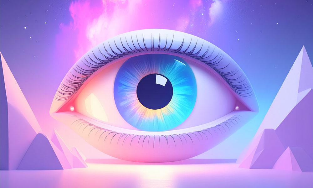
Ever notice how certain brand colors just feel right? It's no accident. Colors speak to us on an emotional level, just like our favorite songs do. They tap into our feelings, shape how we see things, and often guide our choices without us even realizing it. Think about the bold red of a Coca-Cola can - it practically jumps off the shelf, doesn't it? Or the calming blue used by tech giants like IBM and Facebook, making us feel we can trust them with our data.
When you see those golden McDonald's arches glowing against the night sky, they somehow make the place feel warm and welcoming.
Each color tells its own story. Red screams energy and passion. Blue whispers trust and dependability. Green? That's nature's color, perfect for brands wanting to show their eco-friendly side. Purple adds a touch of luxury, while orange grabs attention and yellow just makes people smile. But here's the thing - colors mean different things to different people and cultures.
What works in New York might fall flat in Tokyo. That's why smart brands do their homework, really getting to know their audience before picking their signature colors. Look at Google's logo - that playful mix of blue, red, yellow, and green somehow manages to say both "we're trustworthy" and "we're innovative" at the same time. It's this kind of thoughtful color choice that helps brands stick in our minds and, yes, even influence what we buy.
The Hidden Language of Color in Brand Identity
Most Famous Logos in Red
There's something magnetic about red in branding. Walk down any store aisle or scroll through your phone, and you'll notice how many major brands use this bold, attention-grabbing color. And it's no accident - companies choose red because it works on multiple levels. Coca-Cola's iconic red - it's been turning heads for over a century.
When you see that familiar crimson can, you instantly think of refreshment and good times. YouTube's red play button has become the universal symbol for "watch this," while Netflix's bold red logo pops against dark backgrounds, promising entertainment at your fingertips. CNN's distinctive red lettering, crafted by Anthony Guy Bost, captures the energy and urgency of breaking news.
The psychology behind red is fascinating. It's the color that catches your eye first, triggers excitement, and even stimulates appetite (ever wonder why so many fast-food chains use red?). Plus, in many cultures, red symbolizes everything from good fortune to celebration, making it a smart choice for global brands. Speaking of evolution, Netflix's logo journey tells an interesting story.
Starting with purple and black in its DVD-rental days, then experimenting with yellow and black, the company eventually landed on its current sleek, red design using Gotham font - perfectly suited for our streaming era. Canon's logo transformation is another great example. Since adopting red in 1953, they've stuck with it, and for good reason. The color perfectly represents their energy and passion for imaging technology, making their brand instantly recognizable worldwide.
Most Famous Logos in Blue
Blue dominates the corporate world, and it's no accident. Walk down any busy street or scroll through your phone - you'll spot those familiar blue logos everywhere, from bank signs to tech companies.
It's fascinating that over 40%of Fortune 500 companies have chosen blue as their signature color, especially in industries where trust matters most, like banking, tech, and healthcare. Think about Microsoft's familiar blue logo - it's like a steady, reliable friend that's been with us through countless computer sessions. Same goes for IBM's classic striped design.
These aren't just random choices; they're carefully crafted to make us feel secure and confident in these brands. Ever wonder why so many companies play it safe with blue? It's become something of a corporate comfort zone. Sure, maybe it's partly following the crowd, but there's real psychology behind it. Blue naturally puts people at ease - it's like looking at a calm ocean or clear sky.
That's why it works so well for businesses that want to appear trustworthy and professional. Take Microsoft's window-inspired logo, for example. Those blue squares aren't just pretty design elements - they represent a gateway to innovation while keeping things familiar and approachable. Or look at American Express's evolution: from a simple black and white design in 1850, through various changes, until settling on that confident blue square with the gladiator symbol we know today. Each step in their logo's journey reflects how companies use blue to build and maintain customer trust.
Green: The Color Behind Legendary Brands
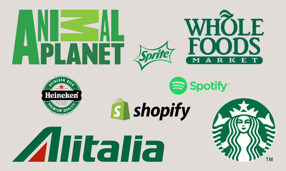
It's amazing how many iconic brands we see every day that use green in their logos. From that familiar Starbucks siren to the crisp look of Sprite and the welcoming store front of Whole Foods, green has become the go-to color for companies wanting to project health, growth, and success.
Even newer players in the business world can't resist green's appeal. Take Shopify - they may have only been around since 2006, but they knew exactly what they were doing when they chose their shade of green. And who can blame them?
Green just naturally makes us think of fresh starts, wellness, and prosperity. Some brands have really committed to their green identity. Heineken is probably the best example - they played around with different colors early on, but for the last 141 years, that distinctive green bottle and logo have been unmistakable. The little green Android robot "Bugdroid" has been rocking the same color since Irina Blok designed it in 2007. And let's not forget Lacoste's famous green crocodile - it's been snapping up attention since the very beginning.
NVIDIA's relationship with green has evolved over time -they started with a half-green, half-black eye logo back in '93 before going all-in on green in 2006. Spotify burst onto the scene in 2008 with their now-iconic green branding and never looked back. And while Sprite has given its logo quite a few makeovers since 1961 (twelve, to be exact!), they've stuck with green through thick and thin, from those old-school bouncy letters to today's sleek design.
The Power of Pink in Brand Logos
When you think of pink logos, Barbie probably springs to mind first. But this bold, eye-catching color has made its mark far beyond toys and fashion - just look at tech giants T-Mobile and Lyft, or food favorites Dunkin' and Baskin-Robbins.
These brands aren't just picking pink to stand out; they're tapping into deep cultural meanings that resonate worldwide. Pink packs different punches depending on where you are. In the West, it's the go-to color for everything soft and romantic - think Valentine's Day hearts and luxury beauty brands. But travel across the globe, and pink takes on new life.
In India, it's woven into joyful celebrations and weddings, representing prosperity and warmth. Japanese culture connects pink to the delicate cherry blossoms that remind us how beautiful and fleeting life can be. And in parts of the Middle East, pink carries a more solemn tone, appearing in ceremonies of remembrance. The color's journey through history is just as fascinating. Pink didn't really exist in language until the 1700s, when Madame de Pompadour, the trendsetting mistress of King Louis XV, made it the height of fashion at Sèvres porcelain factory.
During the Renaissance, pink evolved into a symbol of refined taste and beauty. Fast forward to modern times, and you'll find pink making waves in corporate branding - from Baskin-Robbins' 1953 debut to Dunkin's iconic 1967 redesign. Even digital-age companies like Dribbble, Banijay, and Lyft have embraced pink's enduring appeal.
Black: The Color That Defines Iconic Brands

It's fascinating how many of the world's most recognizable brands gravitate toward black in their logos. Think about it - from Nike's swoosh to Chanel's interlocking C's, black has become the go-to color for brands that want to scream luxury and timeless appeal.
Walk down any high-end shopping street and you'll notice a pattern: Gucci, Louis Vuitton, Dolce & Gabbana - they all lean heavily on black in their branding. It makes sense when you consider what black represents: sophistication, power, and that classic "never goes out of style" vibe that fashion brands love. But it's not just fashion. Tech giants like Apple and Uber, media powerhouses like The New York Times and HBO, and even car manufacturers like Mercedes-Benz and Audi all harness the power of black. Take the BBC logo, for instance - those simple black letters in white boxes have become instantly recognizable worldwide(though interestingly, BBC News breaks away from this with its signature red).
What's really clever is how versatile black can be. Look at Zara and Montblanc - their minimalist black logos feel modern and fresh, while still maintaining that premium feel. Whether it's Gillette razors or Giorgio Armani suits, brands use black when they want to convey quality and craftsmanship. It's like a visual shorthand for "premium" that resonates particularly well with luxury consumers.
Yellow Logos That Made History
Yellow logo shave a special power to catch our eye and lift our spirits - it's no wondersome of the world's biggest brands have embraced this sunny shade. Think about it: when you see those golden McDonald's arches glowing in the distance, they're instantly recognizable, like an old friend beckoning you over.
The classic yellow border of National Geographic has been framing our window to the world since 1888, turning each magazine cover into a portal of discovery. And who can miss Best Buy's bright yellow price tag logo, promising deals that make our wallets a little happier? While blue might be marketing's favorite color these days, yellow has a way of standing out from the pack.
Some brands have stuck to their yellow roots for generations - take Ferrari's iconic prancing horse on its yellow shield, which has been turning heads since 1929. Twinings Tea has kept their yellow lion crest proudly unchanged for over 230 years, proving that some things really do get better with age. Not every yellow logo started that way, though.
DHL's story is different - they began in 1969 with white letters on red, only switching to their now-famous yellow and red combo in 2002 when Deutsche Post took over. But whether they've always been yellow or came to it later, these logos have become part of our everyday visual language, brightening our world one brand at a time.
Orange: The Color Behind Iconic Logos

Orange packs a punch - it's vibrant, warm, and grabs your attention right away. When you think about brands that use orange in their logos, some heavy hitters come to mind: Amazon's friendly smile, Home Depot's familiar square, Mastercard's overlapping circles, and even newer players like SoundCloud and Bitcoin. Take Grubhub's journey with orange, for example.
They didn't start out with their current look. Back in 2004, they went with a simple design: a red square with a glossy circular design inside. For about a decade after that, they stuck with red lettering inspired by California street art. But when Dutch company Just Eat Takeaway.com bought them in 2021, everything changed - they switched to that orange logo we know today, with its distinctive symbol next to the company name.
Home Depot's relationship with orange goes way back - they've been rocking that bold orange color for 40 years now. Their clean white lettering in that classic stencil style pops against the orange background, creating a perfect balance that reflects their no-nonsense, trustworthy brand. And who can forget Amazon's clever logo? That orange swoosh that doubles as a smile, stretching from 'a' to 'z', isn't just cute - it's purposeful. The orange brings warmth and friendliness to their brand, making customers feel good about shopping with them.
Purple's Royal Roots: From Ancient Status Symbol to Modern Brand Color
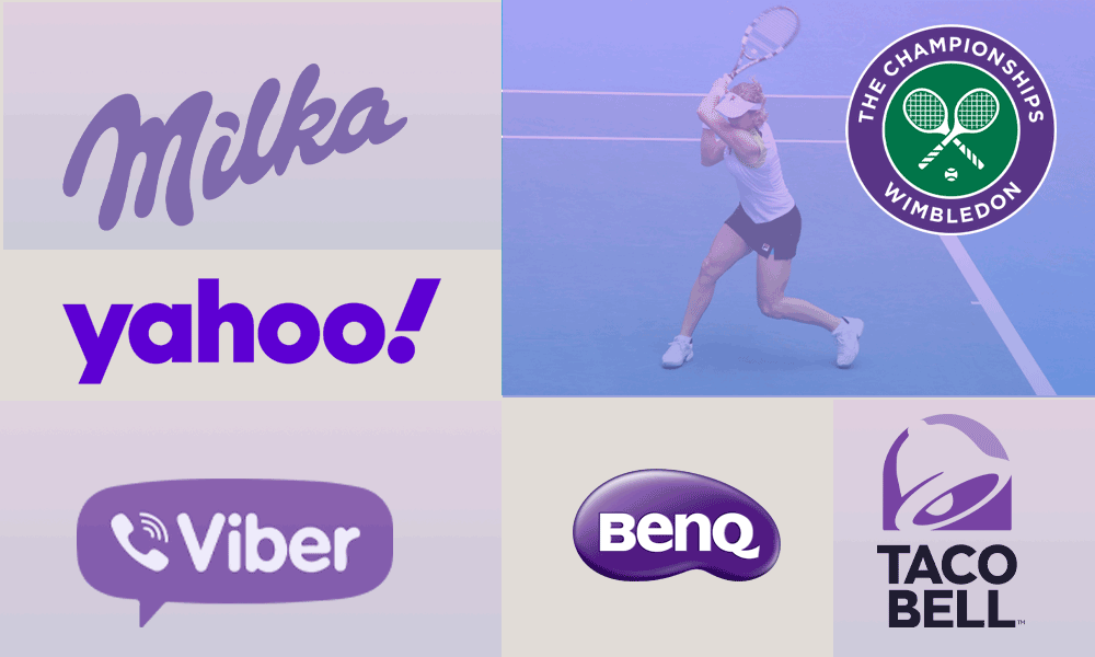
Purple has always been more than just a color - it's a symbol of luxury and power that dates back centuries. Today, some of the world's biggest brands tap into this rich history by incorporating purple into their logos and identities. Take Yahoo, which has rocked its purple logo since 2004, or Milka chocolate, which has been wrapped in its signature purple packaging since 1908.
Taco Bell also jumped on the purple bandwagon about a decade ago, using bold purple shades to create their now-iconic bell design. The color's exclusive reputation comes from its fascinating history. Back in the day, purple dye was incredibly rare and expensive - so much so that only royalty, religious leaders, and emperors could afford it. This explains why you rarely see purple on national flags even today. The prestigious Wimbledon Championships and the messaging app Viber, have embraced purple as their signature color. The story of purple dye itself is pretty incredible.
It started with the Phoenicians crushing up sea snails to make the color. Later, artists got creative by mixing blue and red pigments. But the real game-changer came in the 19th century when someone accidentally created mauve, the first synthetic purple dye. Even ancient celebrities were obsessed with purple. Cleopatra, Egypt's famous queen, went all out with it - decorating everything from her boat sails to her palace walls in Tyrian purple. Julius Caesar was so impressed when he visited that he made purple togas an exclusive right of Caesars. Talk about a power move!